
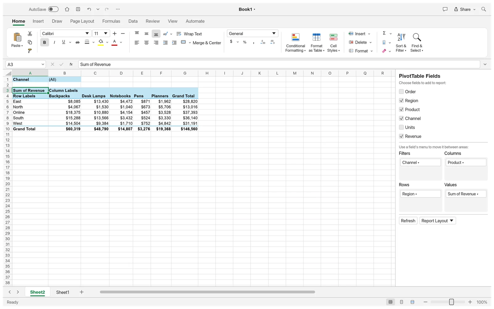
A table is good at keeping records; a summary helps you notice a pattern. Charts compare values visually, while PivotTables group repeated categories without changing the original records. Start with a small question, such as which region has the highest total, before adding more fields or formatting.
Before you start
Use one header row and one record per row. Keep a revenue column numeric, use consistent category names and remove blank rows inside the source range. The desktop GridCraft app offers more room to explore the ribbon and the field list; the sales sample in the web editor is a convenient starting point for looking around. This tutorial describes the desktop workflow, and controls may differ between alpha versions.
Try it in a workbook
- In the desktop app, create headers Category and Amount in A1:B1. Add Travel / 120, Supplies / 85 and Travel / 45 in rows 2 to 4.
- Select A1:B4 and use the chart command from the toolbar or Insert menu. Choose a column chart, then check that the amounts and category labels match the cells.
- With the same source range, open the PivotTable command. Use Category as the row field and Amount as a value field, summarized by SUM.
- Check the summary: Travel should total 165 and Supplies 85. Save the workbook and reopen a copy to verify the result.
Region    Product    Revenue
North     Studio     480
South     Studio     320
North     Workshop   240

North total: 720
Grand total: 1,040Check your work, then go further
Compare the summary against the original rows. In the miniature dataset below, North should total 720 and all regions should total 1,040. A chart should answer the same question as the table it uses; a clear title and consistent units make it easier to interpret. Save an XLSX copy, reopen it and inspect both the data and its summary. When a workbook will be exchanged with Excel, review the chart and PivotTable there as well.
Chart and PivotTable controls can change between alpha releases. This guide describes the desktop workflow; the browser workspace offers a simpler editing experience.